


WHAT IS "ALL?"
All is a design conference focusing on educating designers about how to be inclusive in regards to design work. One day of the conference is focused on designing for accessibility, and how to design with the differently abled in mind. The other day of the conference is focused on diversity and how to design with people of different backgrounds in mind. The mission of the conference is to increase inclusivity and diversity in design by emphasizing a consideration for all kinds of users including people of differing abilities, ethnicities, sexualities, and gender identities.

TYPOGRAPHY
The typeface chosen for this conference is Tiresias Infofont. This face was designed by the Royal National Institute for the Blind with John Gill for the purpose of being easy for people with impaired vision to read.


TRITANOPIA

DEUTERANOPIA

PROTANOPIA
COLOR PALETTE
The color palette for this conference was chosen with the colorblind in mind. The colors are different enough in shade to be differentiable even with three common types of color blindness.

SLOGAN
The line motif present throughout the conference was born out of the frustrations of people who have experienced exclusive design. Design today is not always friendly to people with differing abilities or backgrounds. Often, design and things that are designed (so, everything) cannot be accessed by people who use a screen reader, or who are hard of hearing. Often, design and things designed don't think about the implications of words or images on people of color or people in the LGBT community. These people and their advocates are frustrated with the state of design today, and are drawing a line. This is the end of exclusive design, and with this conference, the era of inclusivity in design can begin to be ushered in.
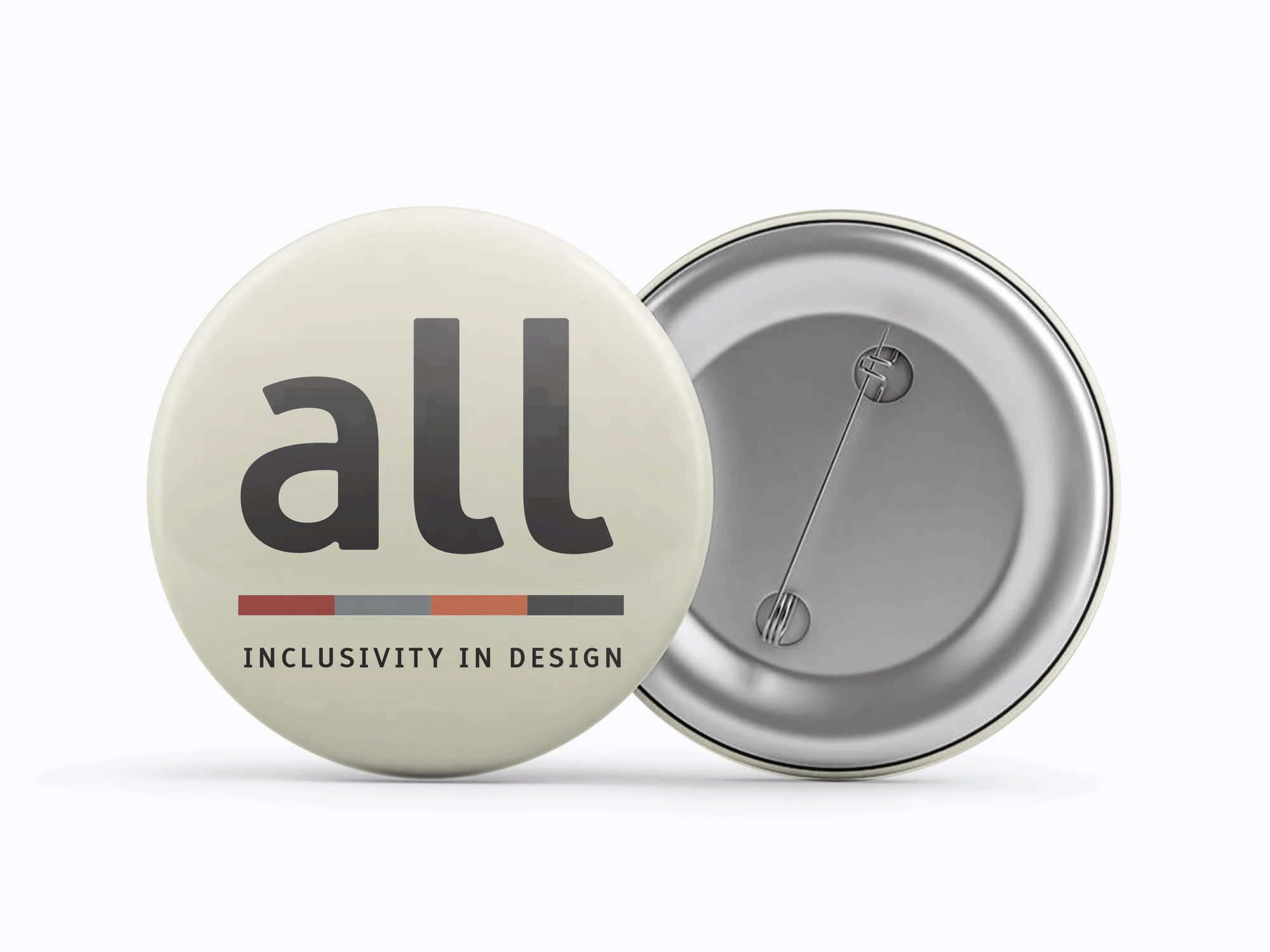
BUTTONS
As with many conferences in today's world, buttons are available to help rep the conference, and also to help identify yourself within it. Buttons designed for the conference include pronoun buttons, buttons with a variety of common pride flags, and a button meant to represent people of color. These buttons can be worn to help other people in attendance get to know you and your perspective a little bit easier.

BADGES
In addition to the buttons, badges are an obvious choice for identification. With your name prominently displayed, a color differentiating speaker, volunteer, and attendee, and with a cloth lanyard perfect for hanging buttons, this badge will give everyone you meet at the conference the basic information about who you are efficiently.


ZINES
Everyone at the conference receives a set of three zines. One for each day, and one with a schedule, map, and glossary of words that might be used in speeches. These are meant to make conversation and understanding as easy as possible. The day focused zines are full of a broad overview of ways to improve design for accessibility or diversity as well as a list of helpful references. Everyone can start on more of the same page, and have something to turn to when they have questions they might not feel comfortable asking. When unfolded, the day zines become posters that display all of the information from inside the zine. These can be displayed in offices or in any workspace a designer might use to help them retain and enact all the things they learned at the conference. Not pictured here, the general overview zine unfolds to a map of the conference area.
ANIMATION
To get the word out about this conference an animation was developed to be shown as an ad. Through the minute or so you can get the gist and pertinent information regarding the conference and plan accordingly.
THE BOX
The box had a unique cover that showed all the art in the exhibition with heavy white borders to separate them. The top opened as a flap to reveal a pocket inside holding all the materials. The inside of the box was patterned with the UU Associations logo, a chalice. In VALUUES, the refresh, these boxes would be available to all recognized UU Churches to show the new emphasis on the seven principles to the congregants directly. Easy to set up and plan an event around, the exhibition could also serve to reintroduce the church to the community around it, reminding people of its presence and well, its VALUUES.

CONCLUSION
This conference has the potential to make the world a little bit better. When we design with more people in mind, more people have a more positive experience with a product or service and it brings them back to it. Everyone could stand to be a little more inclusive and make the little bit of effort required to make someone else's experience a whole lot better.
View process for the original conference here and process for the animation here.