


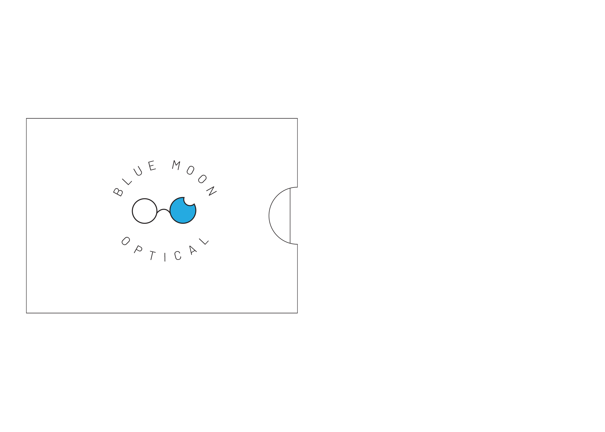
THE COMPANY & THE LOGO
Blue Moon Optical is a local eyeglasses and repair shop in San Marcos, Texas. Specializing in helping people find glasses that fit their style and needs perfectly, and also performing repairs, Blue Moon is a great local find. The original logo focused heavily on the blue aspect and used a very basic moon shape in one of the o's of "moon." The new logo is modern and clean and features a pair of eyeglasses that resemble a blue moon. This new modernity reflects both the atmosphere and consumer base of the shop. The thinness of the glasses frame relates to the popular vintage frames that are sold at Blue Moon Optical.

#27AAE1

#BBD531

#B3B4B6

#A14F9E

#ED7323
COLOR PALETTE
Blue was an obvious choice in the color palette, but a brighter blue was chosen rather than the darker blue in the original logo to make the brand a bit more vibrant and upbeat. Gray was a complement for the blue in lighter parts of the branding. The rest of the colors, added secondarily, were included to really make the branding loud and to pop with color.


TYPOGRAPHY
Barlow was chosen for its modern look and it's thin weight. It has a weight that's similar to the "vintage' glasses within the logo and it's also very clean. It resembles slightly typefaces used in medical fields or even in some eye charts.

PHOTO STYLE
The photography used in this project was mostly this pattern of different faces. Blue Moon Optical likes to believe in "Glasses for Everyone" and this pattern was created with that in mind. Any high quality photo of a face looking straight at the camera could easily be utilized. Everyone can find some specs at Blue Moon Optical.


PATTERNS
Several patterns were created for this project using several different facets of the brand. Some use parts of the logo or different shapes of glasses frames. One pattern was created specifically for an eyeglass repair kit, featuring icons of the things inside. Another was created using the phrase "look and see" and features pops of the secondary colors among the gray.

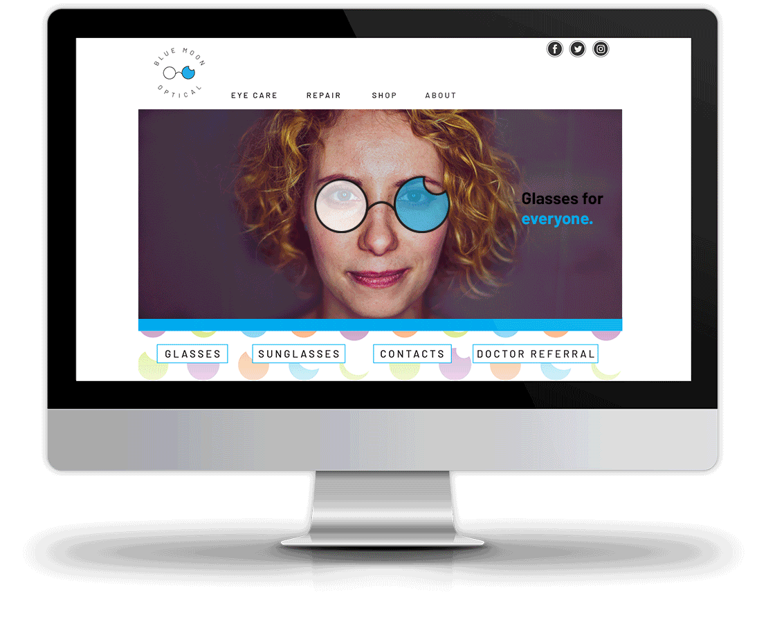
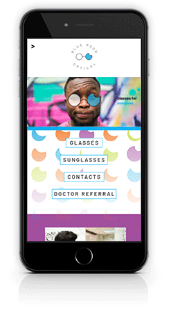

THE WEBSITE
The website shows in detail all of the services offered by Blue Moon Optical: eyewear and its purchase, eye care and health, and also repair. All while emphasizing the accessibility of Blue Moon Optical and the idea of "Glasses for Everyone."


PACKAGING
Several different packages were created for Blue Moon Optical including a drawer box glasses case featuring the face pattern, an eyeglasses repair kit with a patterned sleeve, two patterned bottles of eyeglasses cleaner, patterned gift bags, and a gift card with sleeve.


APPAREL
Along with packaging, apparel was created to help advertise outside of the shop. Shirts and buttons were the main staples, featuring the moon and glasses patterns, as well as faces from the photo pattern.


SOCIAL MEDIA
The social media for Blue Moon Optical was rebranded to include the new color palette as well as some lighthearted humor. The text is consistent with black type on a colored background.

IN THE END
This brand was the most comprehensive brand I had done up to this point and it was a great challenge and learning experience to see how to brand across several assets and touchpoints and how to stay consistent and yet fresh with every new angle.